Introduction of Mastering Data Visualization with Power BI
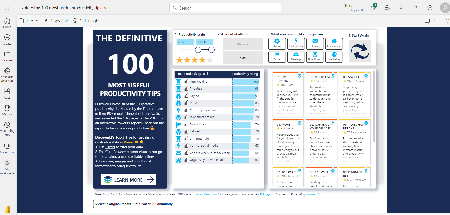
Data visualization is an essential aspect of modern business intelligence, enabling users to gain insights from vast amounts of data quickly and effectively. Microsoft Power BI is a powerful tool that empowers users to create compelling and interactive visualizations, turning raw data into actionable insights. In this comprehensive guide, we will explore tips and tricks to master data visualization with Power BI, enabling you to create informative and engaging reports and dashboards.

Understand Your Data
The foundation of any successful data visualization is a deep understanding of the data itself. Before diving into Power BI, take the time to understand the data structure, types, and relationships. Conduct thorough data profiling and data cleansing to ensure accurate results in your visualizations.
Data Visualization Plan
Effective data visualization requires careful planning. Outline the key objectives of your report or dashboard and identify the target audience. Determine the data elements and metrics that are most relevant to your audience’s needs and preferences. Organize the data logically to tell a coherent data-driven story.
Choose the Right Visualization Types
Power BI offers a wide range of visualization types to choose from. Select the appropriate chart or graph that best represents your data and insights. Common types include bar charts, line charts, scatter plots, heat maps, and geographic maps. Experiment with different visualization types to find the most suitable one for your data.
Utilize Power BI Custom Visuals
In addition to the built-in visualizations, Power BI supports custom visuals created by the community and third-party developers. Explore the Power BI AppSource marketplace to find custom visuals that add unique functionality and enhance the visual appeal of your reports.
Leverage Filters and Slicers
Filters and slicers are powerful tools that allow users to interact with data visualizations dynamically. Utilize them to enable your audience to explore data from different perspectives and drill down into specific details. This interactivity enhances user engagement and empowers them to make data-driven decisions.
Implement Conditional Formatting
To draw attention to critical data points or outliers, use conditional formatting in your visualizations. Highlighting specific data based on thresholds or rules makes it easier for users to identify trends and anomalies in the data.
Master the Power Query Editor
The Power Query Editor is a gem within Power BI that enables data transformation and modeling. Learn to use it effectively to clean, reshape, and combine data from multiple sources. Create custom columns, perform data type conversions, and handle missing data to ensure your visualizations are based on accurate and consistent data.
Emphasize Data Labels and Titles
Clear and concise data labels and titles are crucial for effective communication in data visualizations. Ensure that each visual has informative and well-formatted labels, including units of measurement and context. Use descriptive titles to convey the main message of the visualization.
Enhance Visual Appeal with Themes and Branding
Branding your reports and dashboards with a consistent theme adds a professional touch to your visualizations. Power BI allows you to customize colors, fonts, and backgrounds to match your organization’s branding and style guidelines.
Optimize Report Layout
An organized and logical report layout improves the overall user experience. Group related visuals together, arrange them strategically, and leave adequate white space to avoid clutter. Consider the flow of information and the narrative you want to convey.
Implement Drill-through and Drill-down Functionality
Drill-through and drill-down features enable users to explore data at different levels of detail. Implement these features to provide deeper insights into specific data points and allow users to investigate underlying factors.
Use Bookmarks for Storytelling
Create bookmarks to capture specific views of your report or dashboard. By doing so, you can craft a data storytelling experience for your audience, guiding them through the insights in a logical sequence.
Utilize Measures and DAX Calculations
Measures and Data Analysis Expressions (DAX) are essential for advanced calculations and metrics. Master DAX to create custom measures that are not available in your data source. Understand concepts like aggregations, time intelligence, and context to build sophisticated calculations.
Incorporate Advanced Analytics with AI Insights
Power BI integrates with AI capabilities, such as Azure Cognitive Services and Azure Machine Learning. Leverage these advanced analytics features to uncover patterns, perform sentiment analysis, and make predictive forecasts based on your data.
Optimize for Performance and Responsiveness
As your reports grow in complexity, consider optimizing for performance. Minimize the use of heavy visuals or complex DAX calculations that may slow down report loading. Test your reports on different devices and ensure they remain responsive.
Conclusion
Mastering data visualization with Power BI requires a combination of technical skills, creativity, and a deep understanding of your data and audience. By following the tips and tricks outlined in this guide, you can create powerful and informative reports and dashboards that drive data-driven decision-making within your organization. Continuously explore new features, keep learning from the Power BI community, and refine your data visualization expertise to stay ahead in the world of business intelligence. Happy data visualizing!


