Introduction of Dashboards in Power BI
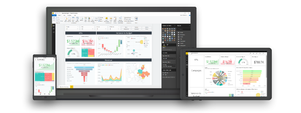
Dashboards in Power BI serve as powerful visual representations of data, providing users with valuable insights to make data-driven decisions. A dynamic dashboard takes this concept a step further by enabling interactivity and adaptability, allowing users to explore data from different angles and respond to changing needs. In this comprehensive guide, we will explore best practices for creating dynamic dashboards in Power BI, ensuring that your reports remain informative, engaging, and relevant to your audience.

1. Define Clear Objectives
Before diving into dashboard creation, clearly define the objectives of your dashboard. Understand the key questions it should answer and the insights it should provide to your audience. Knowing the purpose of your dashboard will guide your design decisions and help you focus on the most relevant data visualizations.
2. Know Your Audience
Understanding your audience’s preferences and needs is crucial when designing dynamic dashboards. Consider the level of detail they require, the data points they find most valuable, and their preferred visualization types. Tailor your dashboard to match the expectations and knowledge level of your target audience.
3. Organize Data in Power Query
To create a dynamic dashboard, begin by organizing and transforming your data in the Power Query Editor. Cleanse the data, remove unnecessary columns, and merge relevant tables. Utilize parameters and functions to create reusable data queries that adapt to changes in underlying data sources.
4. Utilize Data Model and Relationships
Design an efficient data model with appropriate relationships between tables. A well-structured data model enhances the performance and interactivity of your dashboard. Leverage Power BI’s built-in intelligence to automatically detect and create relationships between tables when possible.
5. Leverage Slicers and Filters
Slicers and filters are fundamental components of dynamic dashboards. Use them to allow users to interact with the data and explore specific insights. Create a comprehensive set of slicers and filters that cover essential dimensions and measures to enable versatile data analysis.
6. Implement Drill-Down and Drill-Through Functionality
Enabling drill-down and drill-through capabilities enhances the interactivity of your dashboard. Drill-down enables users to explore data at different levels of detail, while drill-through allows them to access more detailed information related to a specific data point.
7. Use Bookmarks for Storytelling
Bookmarks enable you to capture and save specific views of your dashboard. Use bookmarks to create a narrative or a guided tour through the data, allowing users to follow a logical sequence of insights and visualize the data story you want to convey.
8. Emphasize Data Labels and Titles
Clear and descriptive data labels and titles are essential for effective communication in dynamic dashboards. Ensure that each visualization has well-formatted labels and includes context to provide a clear understanding of the data.
9. Design for Responsiveness
Design your dashboard to be responsive across different screen sizes and devices. Use Power BI‘s responsive layout options to adapt visualizations to various screen resolutions and orientations, making the dashboard accessible on desktops, tablets, and smartphones.
10. Utilize Power BI Custom Visuals
Power BI‘s custom visuals marketplace offers a wide range of visuals beyond the default options. Explore custom visuals to find unique ways to present data and enhance the overall user experience. However, exercise caution and ensure the custom visuals are reliable and well-maintained by the developers.
11. Utilize Hierarchies
Leverage hierarchies in your data model to allow users to view data at different levels of granularity. Hierarchies are useful for organizing data logically and enabling users to navigate through data more intuitively.
12. Create User-Friendly Navigation
Design a user-friendly navigation system that allows users to explore the dashboard seamlessly. Provide clear signposts and cues to guide users through the different sections of your dashboard. Consider implementing a table of contents or a menu for easy navigation.
13. Implement Conditional Formatting
Use conditional formatting to emphasize important data points, trends, or outliers. Highlighting data based on specific conditions helps users quickly identify critical insights and exceptions in the data.
14. Optimize Performance
A dynamic dashboard must be responsive and load quickly. Optimize the performance of your dashboard by limiting the number of visuals on a single page, minimizing the use of heavy visuals, and managing the data refresh schedule efficiently.
15. Test and Iterate
Before sharing your dynamic dashboard, thoroughly test it to ensure all interactions and functionalities work as expected. Gather feedback from potential users and stakeholders, and be prepared to iterate and make improvements based on their input.
Conclusion
Creating dynamic dashboards in Power BI is a powerful way to communicate insights and facilitate data-driven decision-making. By following these best practices, you can design visually engaging, interactive, and user-friendly dashboards that adapt to changing needs and effectively convey the story within your data. Remember to continuously seek feedback from users, stay updated with new Power BI features, and refine your dashboards to ensure they remain relevant and valuable to your audience. With the right approach, Power BI can become a transformative tool in unlocking the full potential of your data and driving business success.


